

The Problem
The Sunflower Showdown brings together leaders and guests from Kansas State University and the University of Kansas for an elevated celebration surrounding one of the state’s biggest rivalries.
The challenge was creating an identity that represented both universities without allowing either brand to overpower the other. Purple and red needed to coexist intentionally, while the overall experience had to feel sophisticated enough for a high-level audience rather than like traditional game-day graphics.
Because the event returns every year, the identity also needed to extend beyond a single invitation or event. It had to become a recognizable, flexible system that could evolve with each annual Showdown.


The Strategy
I approached the project as an event brand system rather than a collection of individual pieces.
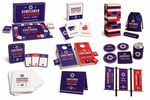
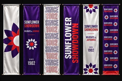
The sunflower became the visual bridge between the two universities, referencing Kansas while combining purple and red into one shared symbol. Bold typography brings in the energy and confidence of the rivalry, generous white space, and elevated finishes keep the identity polished and appropriate for the audience.
From there, I developed a flexible family of marks, patterns, typography treatments, and color applications that could scale across invitations, environmental graphics, banners, backdrops, signage, event collateral, and keepsakes.
The system is intentionally repeatable. Each year, details such as the host city, venue, date, messaging, and applications can change while the core Sunflower Showdown identity remains recognizable.
The goal was to make it feel like a rivalry worth celebrating, not just another football event.
(this project is still in process, so not all the work is completed).