-
Digital Design
Kansas State University
-
Print Design
-
Roll-Up Banners & Event Design
-
Digital Design
-
Merchandise
As a Graphic Designer for K-State’s central Communications and Marketing team, I act as an in-house creative partner for departments and partners across campus. My role is all about balancing the specific goals of my clients with the university’s brand guidelines to make sure everything we put out is cohesive and professional. Whether I’m working on digital assets or print materials, I take each project from the initial idea to the finished product, ensuring that every design stays true to the K-State identity while meeting the unique needs of the campus community.
Horticulture & Natural Space Installations
The Objective
The primary goal of this initiative was to transform the Horticulture and Natural Resources department's main office and reception area into a high-impact, welcoming environment. As the primary touchpoint for visiting parents, prospective students, and faculty, the space needed to transition from a standard administrative office into a visual extension of the department’s mission. The challenge was to bridge the gap between academic professionalism and the organic, tactile nature of the field.
The Creative Strategy
The design direction centers on the core intersection of humanity and habitat. To achieve this, the visual language utilizes large-scale, high-fidelity environmental graphics that prioritize "nature-centric" storytelling.
-
Human-Nature Connection: Rather than focusing solely on landscapes, the selected photography highlights the active relationship between people and the environment. This creates a sense of community and approachability for visiting parents.
-
Visual Continuity: By integrating these visuals into the physical architecture of the office, the design softens the "institutional" feel of the space, replacing it with a biophilic atmosphere that reduces visitor anxiety and encourages engagement.
-
Materiality & Execution: Understanding the high-traffic nature of a main office, I managed the full lifecycle of the project—from conceptual layouts and photo curation to final prepress production. The printed assets were specified for durability and color accuracy to ensure the natural greens and earth tones remained vibrant and true to life under office lighting conditions.
The Outcome
The final installation serves as more than just decoration; it functions as an environmental brand statement. It successfully communicates the department's goals.


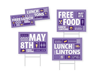
Lunch with the Lintons
I led the graphic design strategy for "Lunch with the Lintons," a signature campus event designed to bridge the gap between K-State students and university leadership. To ensure brand integrity, I used the university’s iconic Powercat Purple and official typography to develop a cohesive, high-impact visual identity. I executed a comprehensive collateral suite—ranging from digital signage and large-format banners to wayfinding yard signs—optimizing each for maximum visibility and student engagement. By meticulously adhering to brand standards, I transformed the event's visual presence into a professional yet inviting experience that resonated with the student body.


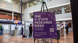
One K-State Research Week
Signage, yard signs, banners, posters, flyers & digital work.


K-State Family Calendar 2026 - 2027
Design of the calendar with important dates for students and parents.


Health & Well-Being Week 2026

![27859_HPU_HealthAndWellBeingGraphics_KV_02_FinalDesigns [Recovered]-09.jpg](https://static.wixstatic.com/media/e1a412_55da495b463149ce8dc237c0a350bafc~mv2.jpg/v1/fill/w_488,h_325,al_c,q_80,usm_0.66_1.00_0.01,enc_avif,quality_auto/e1a412_55da495b463149ce8dc237c0a350bafc~mv2.jpg)
![27859_HPU_HealthAndWellBeingGraphics_KV_02_FinalDesigns [Recovered]-10.jpg](https://static.wixstatic.com/media/e1a412_13092293f1a54ca1b949c263c6dfd5c3~mv2.jpg/v1/fill/w_489,h_326,al_c,q_80,usm_0.66_1.00_0.01,enc_avif,quality_auto/e1a412_13092293f1a54ca1b949c263c6dfd5c3~mv2.jpg)
Merch & Gear


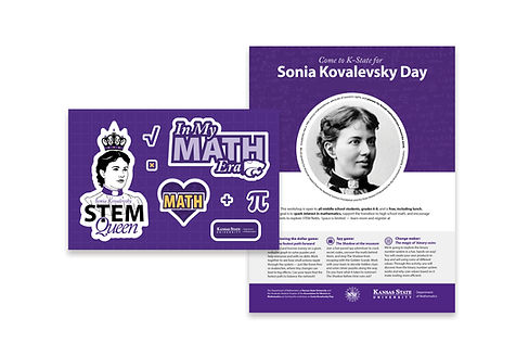
Sonia Kovalevsky Day - Math Day!
Stickers & flyer design
Sonia Kovalevsky Day at Kansas State University is a free, one-day outreach event designed for middle school students (typically grades 6–8) to explore math through fun, hands-on workshops and activities. Hosted by the university’s mathematics department in partnership with the Association for Women in Mathematics, the event is named after pioneering mathematician Sofia Kovalevskaya and aims to spark interest in math and STEM careers, build confidence, and show students that math can be creative, collaborative, and engaging beyond the classroom.
Goal
Develop a cohesive, engaging visual identity for Sonia Kovalevsky Day at Kansas State University that would resonate with middle school students while supporting the event’s mission of making math feel approachable, fun, and inclusive. The deliverables—primarily stickers and a flyer—needed to capture attention quickly, communicate key event details clearly, and create a sense of excitement and belonging around STEM participation.
Problem
Math outreach events often struggle with perception—students in this age group can see math as intimidating, boring, or “not for them.” Existing academic branding can feel too formal or institutional, creating a disconnect with a younger audience. The challenge was to bridge that gap by designing materials that felt playful and culturally relevant without losing clarity or credibility, all while working within university brand guidelines and limited touchpoints (flyer + stickers).
Outcome
The final designs translated abstract STEM concepts into bright, approachable visuals that felt collectible, social, and student-first. The stickers were intentionally designed to be age-appropriate for a middle school audience—using playful illustration, bold color, and simple, relatable messaging to ensure they felt fun and relevant rather than overly academic or juvenile. This made them more likely to be worn, shared, and kept, extending the experience beyond the event. The flyer balanced that same energy with clear information hierarchy, drawing attention while remaining easy to navigate for both students and parents. Together, the system elevated the event’s accessibility, strengthened engagement, and created a memorable, positive association with math. successfully communicates the department's goals.